5 MINS READ
Overview
My Role
Product Designer
Timeline & Status
2025
Installed in October
Client
School of the Museum of Fine Arts at Tufts University
Overview
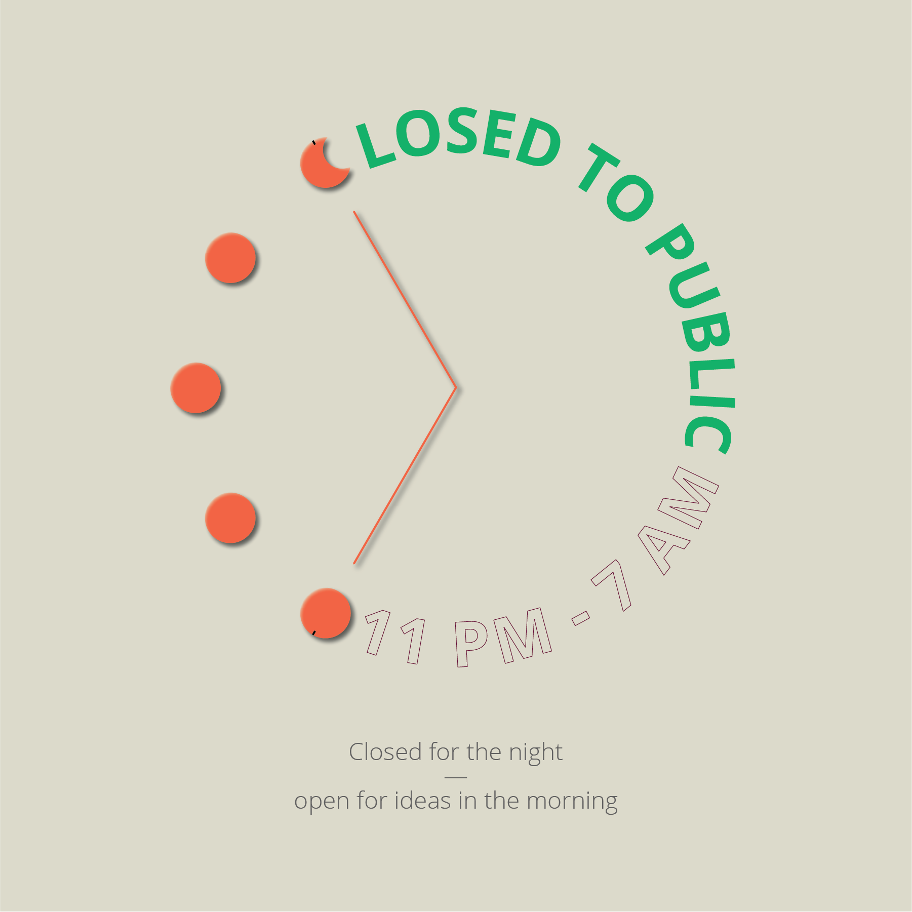
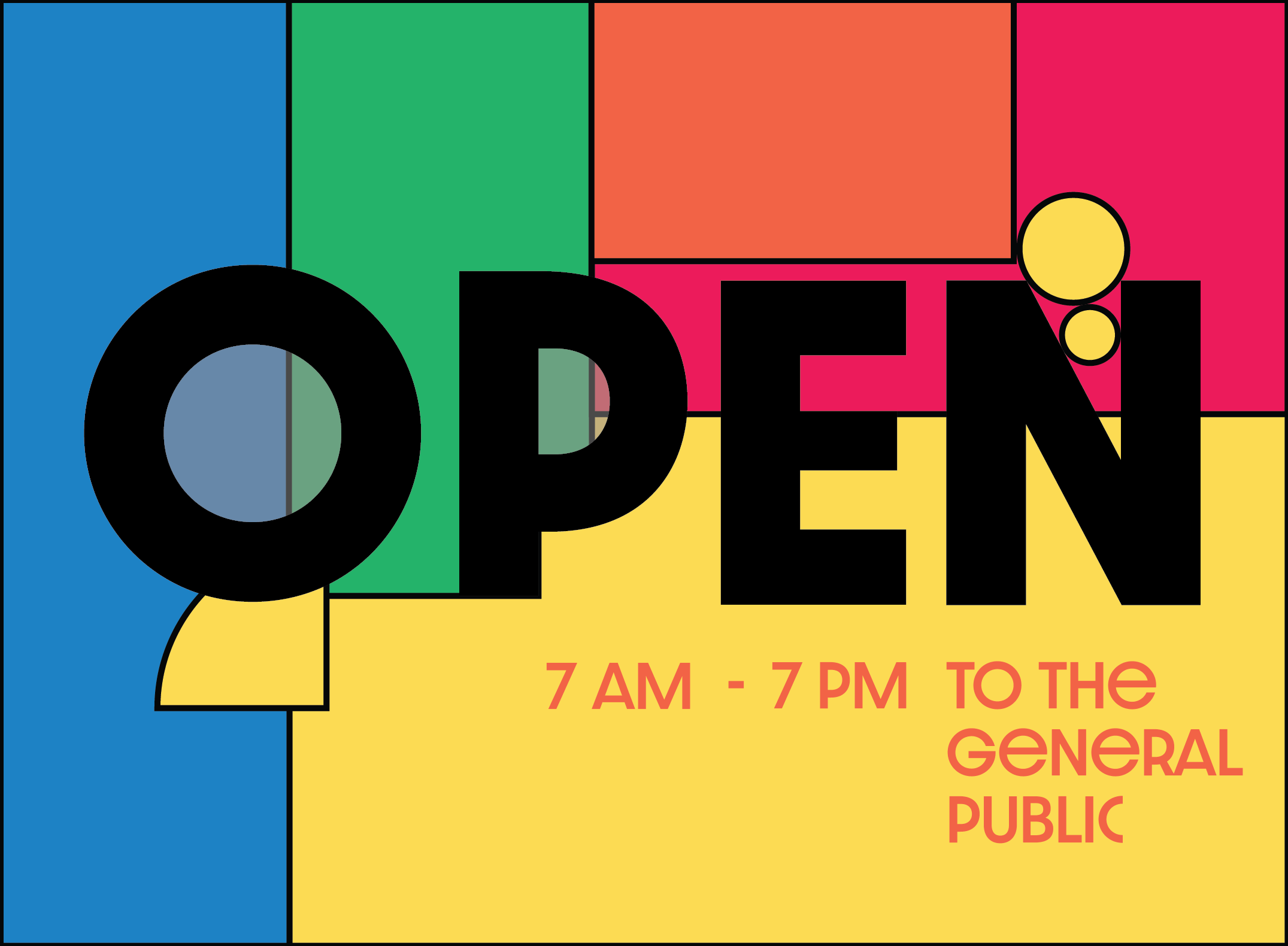
I designed a creative environmental sign that communicates SMFA’s operating hours to the public. The building is open to the general public from 7 am to 7 pm; outside those hours, access is limited to students, faculty, and staff.
The sign strengthens school identity and wayfinding at the entrance while clearly conveying when the building is open—blending product design, institutional branding, and clear visual communication.
Problem
A "System" that wasn't working
For years, the School of the Museum of Fine Arts communicated building operating hours through a single printed sheet of paper taped outside the main entrance. While functional in the most basic sense, this solution created several practical and visual issues.

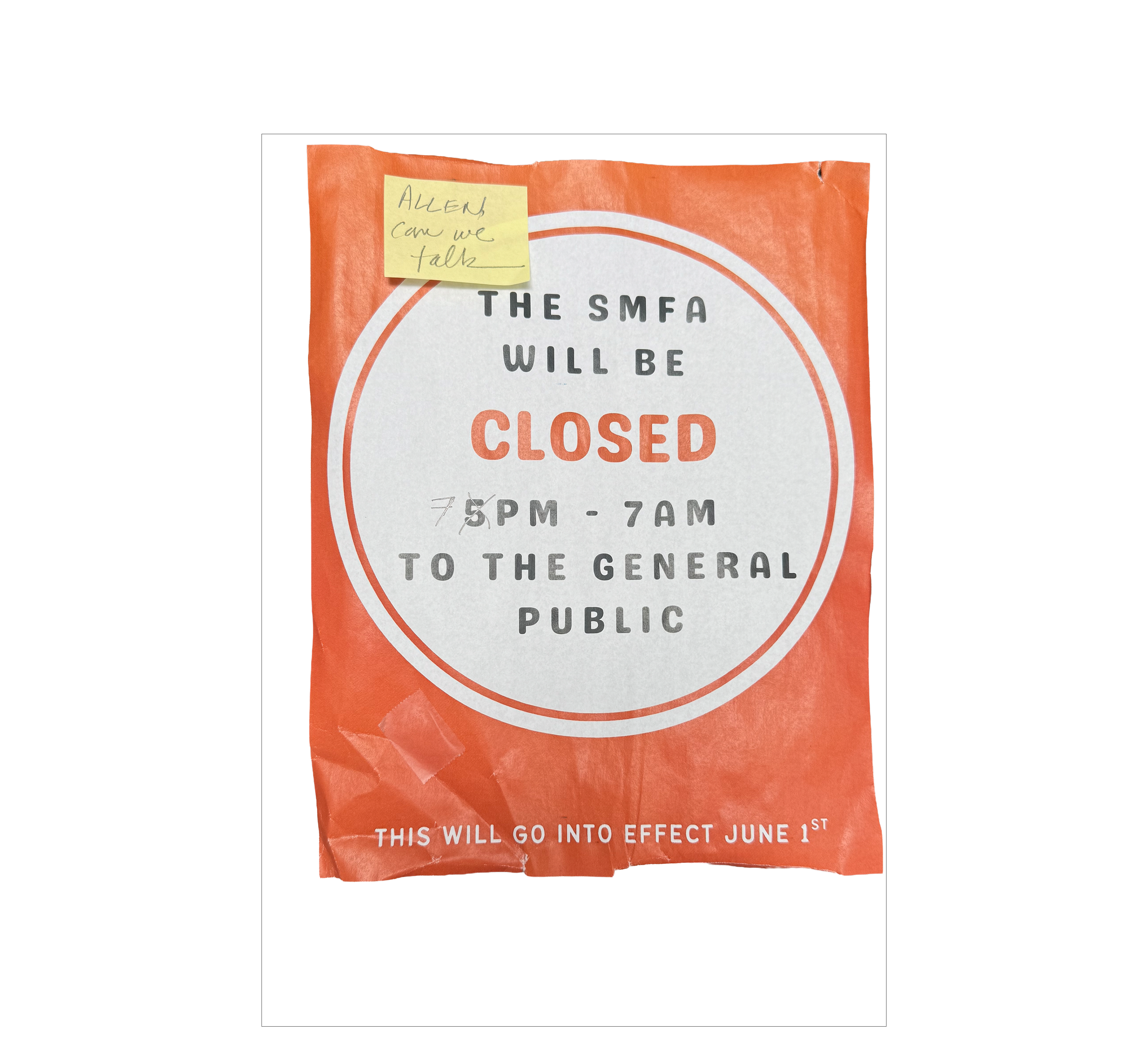
First, the paper frequently fell off due to heavy traffic at the entrance. With students, visitors, and museum guests constantly moving through the doors, the taped sign was not durable and often needed to be replaced.
Second, the informal presentation did not reflect the identity of the institution. As one of Boston's most recognized art schools—serving both undergraduate and graduate students and housing the Tufts University Art Galleries (TUAG)—the temporary sheet of paper lacked the level of professionalism expected from the space.
The design itself also created confusion. The use of colors and styling sometimes led visitors to interpret the sign as café hours rather than building operating hours.
Finally, the typography and color choices were inconsistent with SMFA's visual branding, making the sign feel disconnected from the rest of the school's communications.
Together, these issues highlighted the need for a more permanent, legible, and institutionally aligned solution for communicating building hours.
Context
Design challenge
After observing these issues, I was tasked with designing an alternative signage solution for the building entrance. The new sign needed to clearly communicate operating hours while aligning with SMFA's visual identity.
The goal was to create a solution that felt professional, durable, and visually consistent with the institution's branding, while ensuring the information could be quickly understood by students, visitors, and museum guests entering the building.
Initial Design Exploration
Initial Design Exploration
I began the design process by referencing SMFA's visual identity, incorporating the school's branding colors and graphic elements. I also drew inspiration from the school's mascot and existing visual language to develop several early design directions.
These explorations focused on creating signage that felt cohesive with the institution while remaining clear and approachable for visitors.
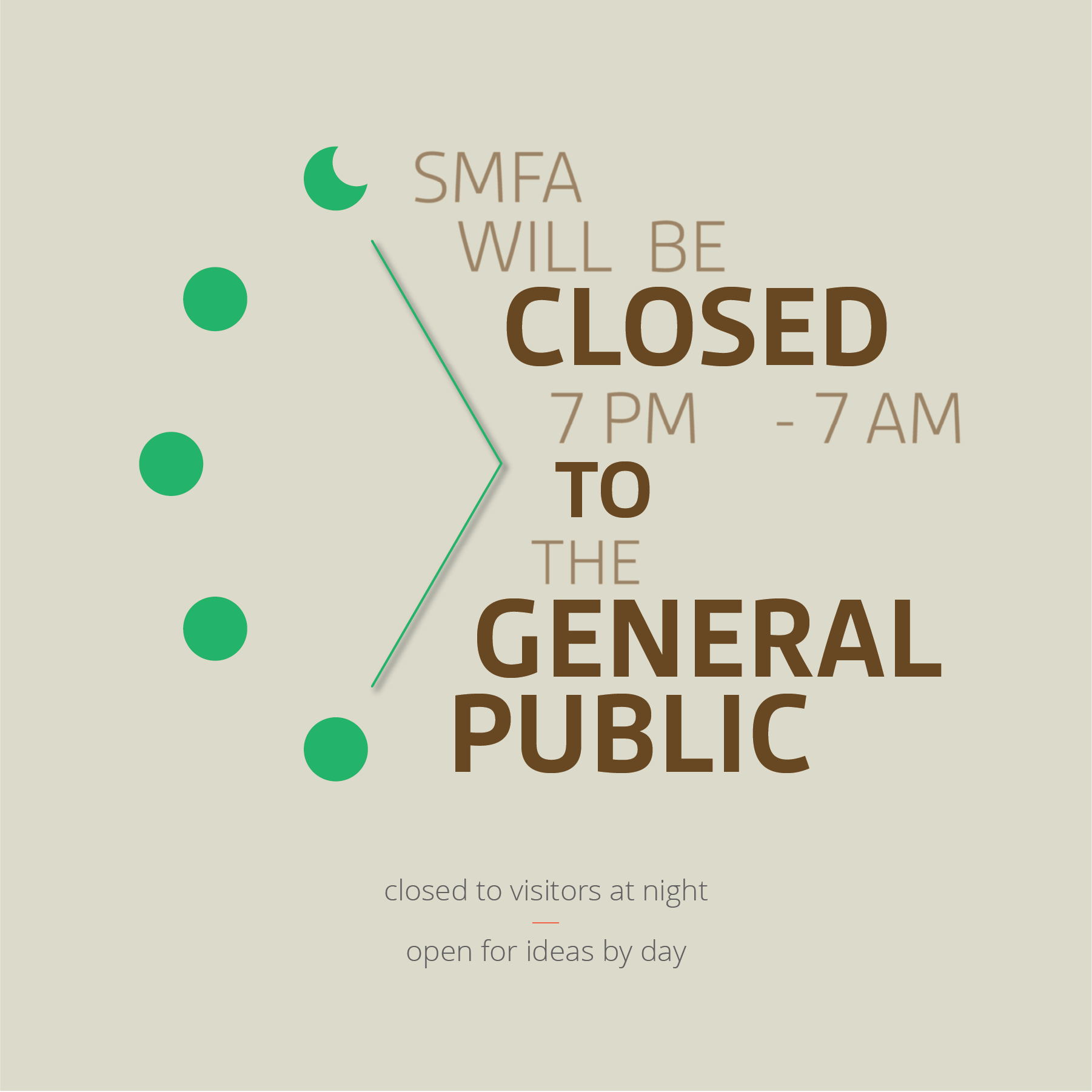
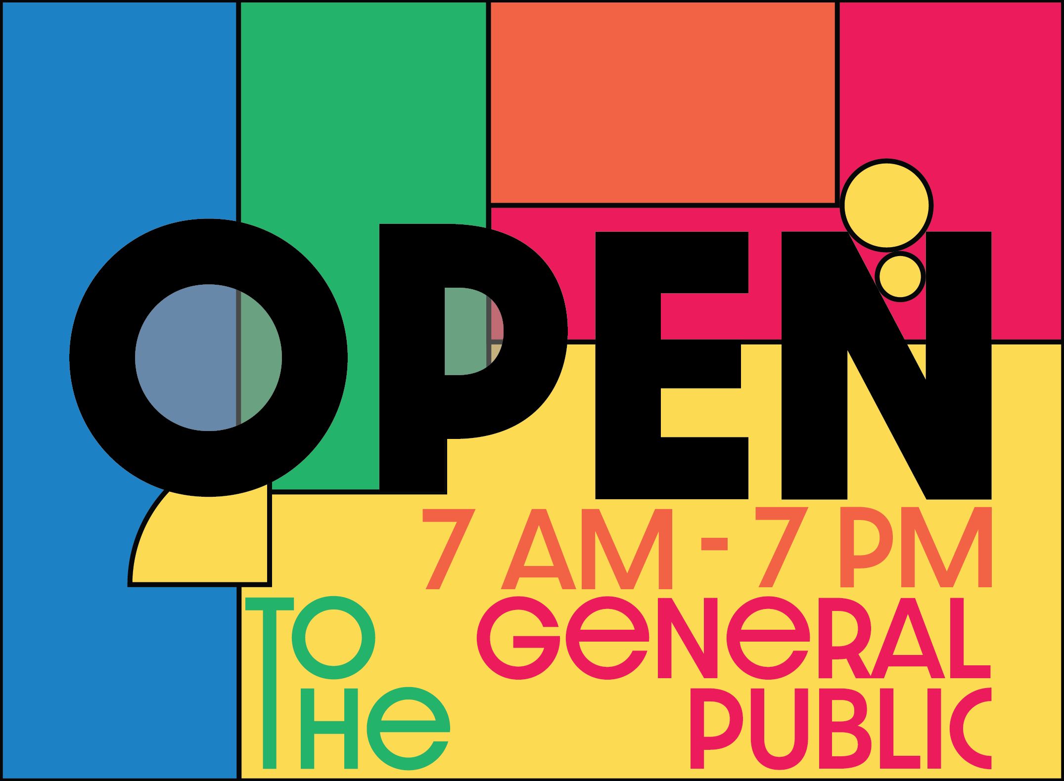
While these designs aligned better with SMFA's branding, they still felt like typical informational signage. Although the typography and colors worked well, the overall experience remained flat.
This led me to explore whether introducing weight, dimension, and spatial presence could transform the sign from a simple graphic into something more intentional within the space.
Final Design Solution
Final Design Solution

Design & Fabrication
Content coming soon.
Visual Design
Content coming soon.
Current Stage
Content coming soon.